UXR/ HFE Intern @ Pegatron Corp.
Transforming a BMC Monitoring System to Support Diverse Diagnostic Workflows
Conducted cross-market stakeholder research across Taiwan and the U.S. to redesign a BMC server monitoring dashboard — aligning information architecture with how engineers of different expertise levels actually diagnose system issues.
As a UX / HFE intern within a 3-person UXD team at Pegatron, I conducted stakeholder research across Taiwan and the U.S. and designed the text-dense wireframe direction for a BMC server monitoring dashboard serving enterprise MIS engineers.
OVERview
ROLE
UX / HFE Intern
Taiwan
DURATION
1 month
2025/12 - 2026/01
DOMAIN
AI server infrastructure · Cross-market
(TW / US)
This project involved designing a BMC (Baseboard Management Controller) dashboard used by server administrators and engineers in enterprise environments. Unlike consumer-facing products, the system needed to support engineers with significantly different diagnostic workflows, technical expertise levels, and market expectations.
The problem
A single rigid dashboard was forcing diverse users into one workflow
Entering the internship, I had to rapidly onboard to a highly specialized domain — learning server architecture terminology (virtual vs. physical CPUs, fan configurations, signal types), system monitoring logic, and the specific operational contexts in which MIS engineers use remote management interfaces. This domain immersion was a prerequisite before any meaningful research could begin.
The existing navigation assumed all engineers follow the same diagnostic path. In practice, MIS engineers with different experience levels and responsibilities had fundamentally different entry points — some prioritized alert states, others began with logs or remote control access.
Hardware-software representation ambiguity
Interviews with U.S.-based sales teams revealed a critical display issue: showing dual virtual CPUs in the interface was being misread by customers as dual physical CPUs — a product perception gap with direct sales implications that required both a design and hardware-level resolution.
Information architecture misalignment
System data was grouped by machine component logic (CPU, storage, fans) rather than by operational task priority. Engineers had to mentally re-map information before they could act — adding cognitive load in time-sensitive situations.
Research
Three stakeholder groups across two markets. One shared problem.
Research spanned multiple stakeholder types across two markets:
The central finding: engineers' diagnostic logic is shaped by experience, role, and familiarity with specific server environments — not by system architecture. The same interface feature carried different urgency for different users. A single fixed layout created friction for everyone, in different ways.
Supporting findings from interviews:
Primary users — responsible for remote server monitoring, rapid restart, and issue resolution. Revealed divergent workflows: one engineer prioritized alert-first navigation; the other relied on log sequences. Both agreed that remote control access (KVM) must never be buried deep in the navigation.
Surfaced market-level expectations for enterprise monitoring dashboards and flagged the virtual CPU display ambiguity — a design decision with downstream sales consequences.
Clarified which system signals were technically feasible to surface in the interface vs. what would require future API development — essential for scoping the IA redesign realistically.
Competitive IA analysis
Analyzed monitoring interfaces from multiple enterprise server vendors to understand how different IA approaches reflect different assumptions about user expertise. This informed the decision to develop two distinct layout directions rather than a single compromise solution.
Design process
Four-stage process from system deconstruction to validated wireframes
1.
System deconstruction
Reverse-engineered existing system functions and mapped the relationships between machine-level data and user-level tasks. This step produced a structured understanding of what the system could do vs. what users needed to accomplish.
2.
Information architecture synthesis
Reorganized fragmented system data into user-centered groupings based on diagnostic task goals. Established information hierarchy prioritizing critical signals over secondary monitoring data.
3.
Two-direction wireframe development
Rather than designing a single layout, we developed two wireframe directions in parallel — reflecting the two dominant user profiles identified in research:
Iconographic + customizable panel — designed for engineers with less experience or those learning a new system. Lower cognitive entry point, visual status indicators, and user-configurable dashboard panels to match individual monitoring priorities.
Text-dense information layout (my primary design responsibility) — designed for experienced MIS engineers who value information density and speed over visual affordance. Key design considerations: logical grouping based on Gestalt principles, Z-pattern reading order, multi-level status indicators (primary system state + granular sub-indicators), and a visual hierarchy that distinguishes critical alerts from informational signals — because not all error warnings require immediate action.
4.
Validation and synthesis
Both wireframes were walked through with the two MIS engineers in structured sessions. Both confirmed that the proposed information sequence — system info → host health → storage info → recent logs, with quick actions accessible from the main view — matched their actual diagnostic priority order. Critical status information and remote control shortcuts were reachable without navigating away from the overview. Based on this feedback, we merged the customizable panel feature into the text-dense layout, giving experienced users information density with the added flexibility of configurable display areas.
Key design decisions
Three decisions that shaped the final system
Decision 1 · Why two wireframes instead of one?
Alternative considered
A single compromise layout serving both user types
Why we chose two directions
Research showed that iconographic affordances valued by less experienced engineers actively created noise for experienced ones. A compromise layout would have served neither well. Developing two directions allowed us to validate both hypotheses before converging.
Decision 2 · Icon use contingent on user expertise
Original assumption
Icons improve usability universally
Research finding
For B2B enterprise tools, experienced users prioritize information clarity over visual affordance. Iconization without sufficient labeling added ambiguity for expert users who had already built mental models around text-based status signals.
Decision 3 · Multi-level alert hierarchy
Problem
All error states displayed at equal visual weight
Solution
Introduced a primary system-state indicator (overall health at a glance) with secondary granular sub-indicators. Since not all error warnings require action, the hierarchy helps engineers triage quickly — reducing unnecessary interruption while ensuring critical states are never missed.
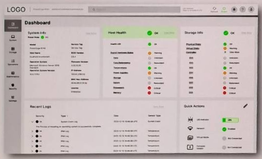
Text-dense dashboard wireframe — information hierarchy follows diagnostic priority order (system info → host health → storage info → recent logs), with quick actions accessible from the main view. Multi-level status indicators distinguish critical alerts from informational signals without requiring page navigation.
Impact
Validated diagnostic workflow alignment across both user profiles
Diagnostic sequence confirmed
Both MIS engineers validated that the redesigned information hierarchy — system info → host health → storage info → recent logs — matched their real-world diagnostic priority order without prompting. Critical shortcuts and status indicators were reachable from the main view, eliminating the need to navigate away mid-diagnosis.
Two-direction approach enabled convergence, not compromise
Developing two wireframe directions in parallel allowed us to test competing design hypotheses rather than settling for a middle ground. Validation sessions revealed which elements from each direction to retain, resulting in a merged layout that preserved the strengths of both.
Research findings were presented to both the software team and the primary business unit. The virtual CPU display ambiguity identified through U.S. sales interviews was escalated as a hardware-level market requirement — demonstrating that UX research surfaced issues beyond the scope of interface design alone.
Quantitative usability metrics are not disclosed due to NDA restrictions.
Reflection
This project required me to operate as both a researcher and a designer in a domain I had no prior knowledge of — rapidly building enough server infrastructure literacy to ask the right questions, then synthesizing inputs from six distinct stakeholder groups across two markets into actionable design decisions.
The most durable lesson was about B2B product design specifically: in enterprise tools, information clarity outranks visual elegance, and the "right" interface depends entirely on what the user already knows. Designing for expert users means designing for speed and precision — not simplification.
Alongside the BMC dashboard, the internship included two additional HFE projects: usability and pressure mapping research for a second-generation EEG-controlled stroke rehabilitation device, and field observation with low-vision users for an AR-assisted museum exhibition tool — extending my ability to apply human factors methods across radically different interaction modalities and user populations.